A specimen book is a strange object. It is a catalogue, a proof and a piece of design in its own right. Volume two has been in pieces on the studio table for the better part of a year. This is how it becomes a book.
Paper and format
The book is 240 by 320 mm, which is large enough to show a display face at a useful size and small enough to hold. It has 248 pages. The paper is uncoated, 120 gsm, chosen because it takes ink without glare. Coated paper makes type look sharper, but it also makes every page feel like a screen. We wanted the book to feel like paper.
Uncoated stock is less forgiving. Thin strokes can spread, and a black that is too heavy will fill in the counters. The test is not a single page but a sequence: a light face, a black face, a page of text and a page of captions. We print the sequence and look at it as a reader would, turning the pages in order.
The binding is cloth hardback, sewn. Sewn sections open flat, which matters when a spread shows a full alphabet. A glued binding would be cheaper and would fight the reader at every page. The cloth is a neutral colour, because the type should be the only thing that stands out.
Setting the pages
Each family gets a section with its own pace. The display faces get large specimens; the text faces get paragraphs at reading size. Ashby Text is shown in a sequence of book pages, since that is what it was drawn for. Sable Grotesk is shown in weights from light to black, with a page of figures and a page of punctuation. Pelham Didone gets the high-contrast treatment: a few lines at a time, with plenty of space.
The order of the families was the hardest decision. We tried alphabetical order, then order of release, then a mix of sans and serif. The final sequence moves between textures so that no two neighbouring sections feel the same. It also puts the two text families, Ashby and Sable, where a reader will meet them early.
Every caption is set in the family it describes. That is a small rule and it caused a large amount of work. A caption in a light weight at 9pt has to be legible on uncoated paper, which is a useful test of the face itself.
Checking the proof
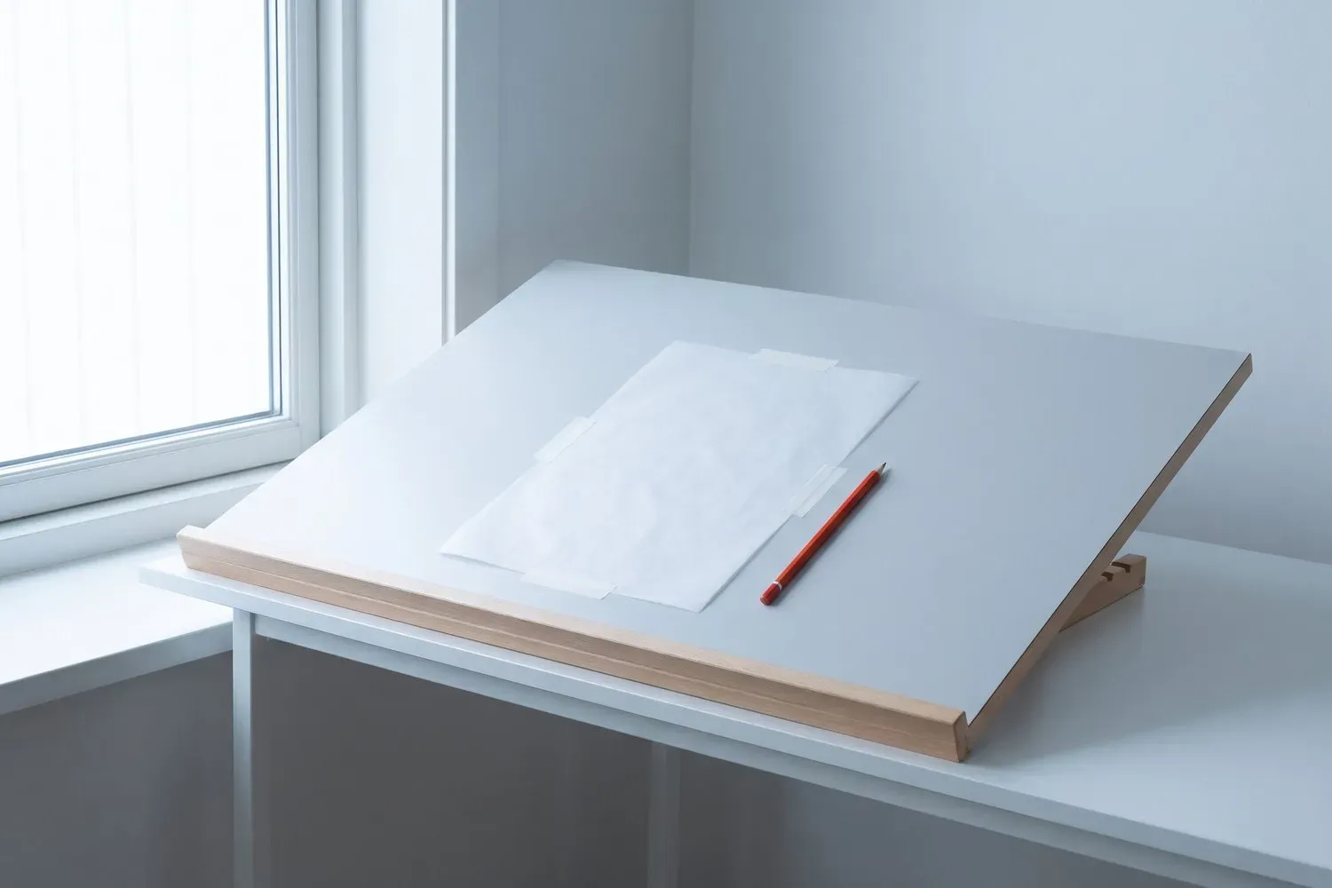
The first proof is always wrong in a way that is hard to see on screen. We read it on paper, with a ruler and a pencil. The list below is the one we use.
- Check the page order and the folios against the flat plan.
- Look for filled counters in the black weights.
- Compare the thin strokes with the approved test page.
- Check that every caption names the right family and style.
- Look at the gutter on a full spread, not a single page.
- Check the cloth and the sewing on the binding dummy.
The second proof is usually close. The third is the one we sign. Then the book goes to press, and a few weeks later a pallet arrives at the studio. We open a copy at random, check a page, and put it on the table. The typefaces page shows the families that fill it.